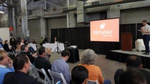
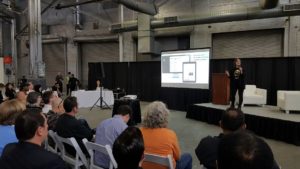
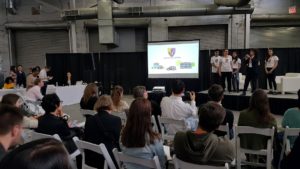
I went to Tech Day today here in NYC, a huge convention for startups and tech companies big and small.
In one corner of the venue they had companies giving brief presentations to the crowd.
I was interested to see each speaker’s overall presentation skills (including body language, verbals, and their slides), as well as their impact on the crowd.

Presentations lasted only about 3 minutes each.
A few things stood out to me:
Acoustics
The acoustics were very unfavorable. This was an open space, like an airplane hanger, with lots of reverberating crowd noise.
If you look at these photos, behind the camera was a huge convention hall with thousands of people talking.
To remedy this, the stage had some speakers and a microphone so each presenter could be heard.

Unfortunately, many of the presenters held the microphone too far away from their mouth to be picked up.
It was especially unfortunate because some of them had really interesting-looking products.
But because they weren’t holding the mic close enough (one was even half-covering it with his hand), their impact disappeared.
Whenever you have to use a microphone, make sure to use it well. Be aware of any background noise.
If people can’t hear you, they will immediately discount everything you say (or ignore you altogether), no matter how much preparation you put into your speech.
The best presenters were those who spoke loudly and clearly into the mic.
Avoiding the use of notes
Most of the speakers were very well-prepared, in the sense that they knew their 3-minute pitch cold.
One woman had to keep pausing to look at her notes which upset the flow of the speech, reduced the impact, wasted her time and the audience’s time, and made her seem less sharp.
Another guy spent most of the 3 minutes just reading from his slides (which are simply notes in another form). That is extremely boring and pointless: people can already read the slides, what they need to hear is your perspective.
But the presenters mostly were very well-versed in their product. They could speak spontaneously and naturally, and their knowledge and expertise came through.

Slides and visual elements
All of the presenters were allowed a deck that was shown on the big screen.
Some of them had just one slide with their logo or company name. Others went overboard with too many slides, requiring them to rapidly click through multiple slides as their time ended.

The best were those in the middle–just 2 to 4 slides, that contained a clear, succinct message.
Slides that had too much text were pointless. Nobody in the crowd is going to read that.
Slides that had large font, simple and brief messages or numbers, were the best. They were the easiest to read and understand by the audience.

And a few decks included videos to actually demo their product, which was a great feature that kept even more of the crowd’s attention.
Multiple presenters
A few of the companies had multiple speakers onstage. This worked out extremely well.
Instead of one person talking for 3 minutes straight, there were 2 or 3 people each touching on a different topic with their own voice.
This created more variety and an engaging experience for the audience.

The context for these presentations was this: a large open space with lots of distractions (noise, exhibit tables, cell phones of course); anyone can wander over to the stage area or walk away at any time (there are no doors or barriers); poor acoustics; a stage and a big screen for the presenter’s powerpoint deck.
It wasn’t the ideal setup, but it was still a great opportunity to get exposure… for those who could speak well, manage the distractions, and engage the audience for 3 solid minutes.
The absolute best presenters attracted more people to join the crowd around the stage.
People pick up on charismatic and passionate energy, and are drawn to it like a magnet.
- You Are Who You Surround Yourself With: 6 Tactics to Build Your Network - December 15, 2021
- Executive Presence: 3 Keys to Communicate Leadership Qualities - December 10, 2021
- How to Think on Your Feet in Meetings and Presentations: 3 Mental Hacks - February 13, 2021